ShopDreamUp AI ArtDreamUp

Deviation Actions


![[Pkmn]: Purple Shadow](https://images-wixmp-ed30a86b8c4ca887773594c2.wixmp.com/f/5057ba4c-94c8-4f59-832e-134ca9f49ee6/dch2dps-fb428542-ad21-4015-9c36-d70d24625a65.png/v1/crop/w_184,h_184,x_0,y_2,scl_0.26285714285714/_pkmn___purple_shadow_by_ziocorvid_dch2dps-92s-2x.png?token=eyJ0eXAiOiJKV1QiLCJhbGciOiJIUzI1NiJ9.eyJzdWIiOiJ1cm46YXBwOjdlMGQxODg5ODIyNjQzNzNhNWYwZDQxNWVhMGQyNmUwIiwiaXNzIjoidXJuOmFwcDo3ZTBkMTg4OTgyMjY0MzczYTVmMGQ0MTVlYTBkMjZlMCIsIm9iaiI6W1t7ImhlaWdodCI6Ijw9NzM3IiwicGF0aCI6IlwvZlwvNTA1N2JhNGMtOTRjOC00ZjU5LTgzMmUtMTM0Y2E5ZjQ5ZWU2XC9kY2gyZHBzLWZiNDI4NTQyLWFkMjEtNDAxNS05YzM2LWQ3MGQyNDYyNWE2NS5wbmciLCJ3aWR0aCI6Ijw9NzAwIn1dXSwiYXVkIjpbInVybjpzZXJ2aWNlOmltYWdlLm9wZXJhdGlvbnMiXX0.KGGQ737vPRGDr8iXI_aAteKLnDJc4G5d3pKUpPvY0UA)
![[Pkmn]: Purple Shadow](https://images-wixmp-ed30a86b8c4ca887773594c2.wixmp.com/f/5057ba4c-94c8-4f59-832e-134ca9f49ee6/dch2dps-fb428542-ad21-4015-9c36-d70d24625a65.png/v1/crop/w_92,h_92,x_0,y_1,scl_0.13142857142857/_pkmn___purple_shadow_by_ziocorvid_dch2dps-92s.png?token=eyJ0eXAiOiJKV1QiLCJhbGciOiJIUzI1NiJ9.eyJzdWIiOiJ1cm46YXBwOjdlMGQxODg5ODIyNjQzNzNhNWYwZDQxNWVhMGQyNmUwIiwiaXNzIjoidXJuOmFwcDo3ZTBkMTg4OTgyMjY0MzczYTVmMGQ0MTVlYTBkMjZlMCIsIm9iaiI6W1t7ImhlaWdodCI6Ijw9NzM3IiwicGF0aCI6IlwvZlwvNTA1N2JhNGMtOTRjOC00ZjU5LTgzMmUtMTM0Y2E5ZjQ5ZWU2XC9kY2gyZHBzLWZiNDI4NTQyLWFkMjEtNDAxNS05YzM2LWQ3MGQyNDYyNWE2NS5wbmciLCJ3aWR0aCI6Ijw9NzAwIn1dXSwiYXVkIjpbInVybjpzZXJ2aWNlOmltYWdlLm9wZXJhdGlvbnMiXX0.KGGQ737vPRGDr8iXI_aAteKLnDJc4G5d3pKUpPvY0UA)


Description
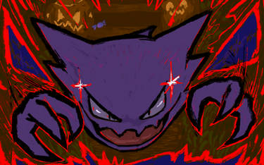
#125 - Electricity runs across the surface of its body. In darkness, its entire body glows a whitish-blue.
Character owned by Nintendo/Gamefreak
Character owned by Nintendo/Gamefreak
Image size
975x1200px 476.88 KB
© 2013 - 2024 WhyDesignStudios
Comments56
Join the community to add your comment. Already a deviant? Log In
Strolling around DeviantArt I stumbled across this piece and I kinda felt I should write something about it.
So, let's get started. First of all, I want to discuss the outlines, which in fact are the extremely well done. When I first looked at this piece I found myself thinking 'well, these lines are really bold, hopefully they don't mess up the image', but they don't. On the contrary, they do make it more interesting to look at and even provide some kind of dynamic.
Plus, the outlines are clean and smooth and it's really hard to locate any unclean spots or mistakes.
Next point - colors and structure. I really do like the colors you chose. They might seem very bright, but work more than well with these outlines of yours. The subtle structure you put over it creates a very nice effect, reminding me of traditional painting and forming a contrast to the hard lines. Anyway, I have to admit that I would have chosen a darker color for the lights. The contrast between the main color and the lights is very high and lets electabuzz look kind of glossy, which in turn does not really fit to the rest of the picture. This, of course, might be subjective, but I also have to mention that the lights brightness kind of kills the structure, too, which in turn is a pity.
I know, it's a Pokémon, but nevertheless I want to say a few words concerning the pose and the anatomy. The pose, as you might know, is not that special or impressive, yet combined with the colors and the lines it is good enough to let elecatbuzz look fascinating. Nevertheless, I get the feeling that it is a bit plump - especially its back seems to be too rotund for my taste. Never mind though, on the first glimpse I didn't notice it, either.
Oh and before I'll finish, one last thing about the background. Of course, it's a real simple one, but the color gradient and the structure help to highlight electabuzz and the missing of any dark outlines in the background is a real nice way to set the stage for electabuzz.
As you might have mentioned I do like this piece and the few things I was able to criticize really are of minor importance compared with this pieces overall impresson. Keep up this good work!